
For SS25, Jonathan Anderson’s show made solid surreal gestures with a soft take on gravity.
SPRING found many designers rejecting “tradition” (a buzzword commonly aimed at historical houses) for a more freewheeling approach.
Jonathan Anderson’s SS25 outing was one such example: it stuck to the winsome, surreal look that the designer has established at his namesake label these last few years. This season’s show took us on a cross-continental (and highly experiential) journey.

Backstage, Anderson described the inspirational journey as “a therapeutic session which ends up on a territory where a free-wheeling vein reigns supreme.”
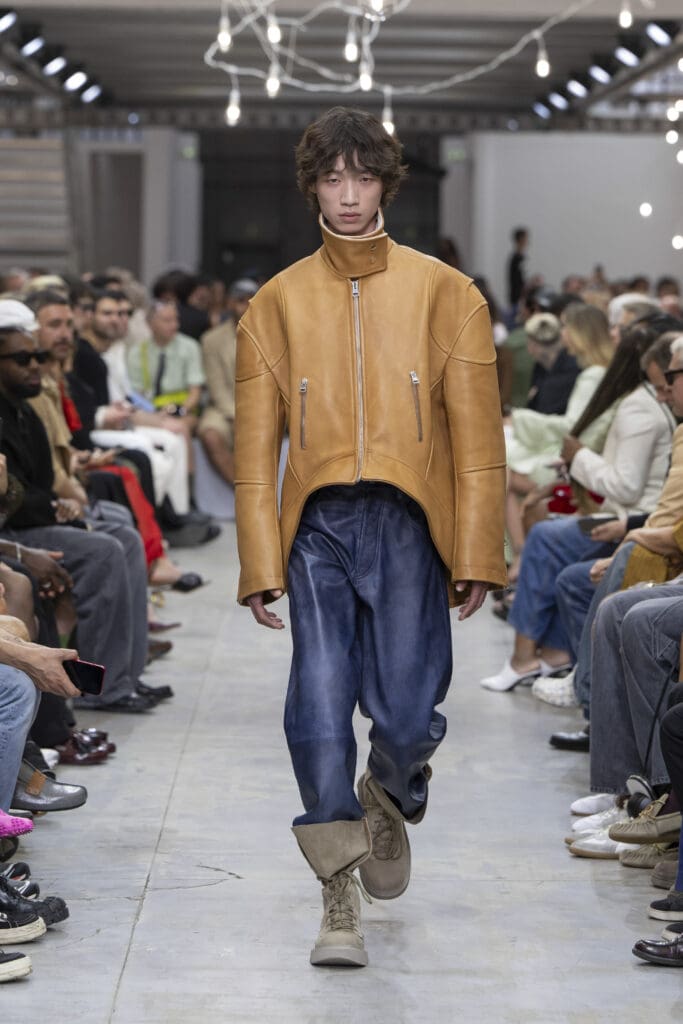
With traditional tailoring references remaining a strong trend both on and off the runway, it’s no surprise that Anderson’s Spring collection drifted away from the quotidian offerings created by his commercial counterparts.
The designer knows a thing or two about such styles—his accessories are sold globally and are incredibly coveted by Gen Z youngsters—but his creative practice still upholds a proclivity for abstraction.
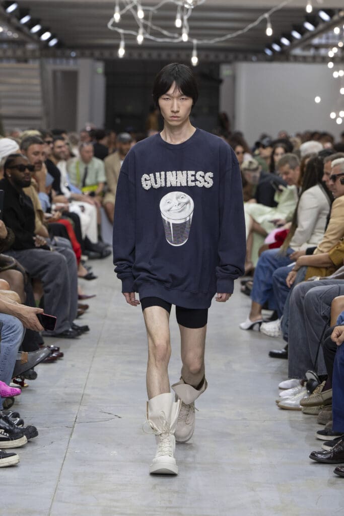
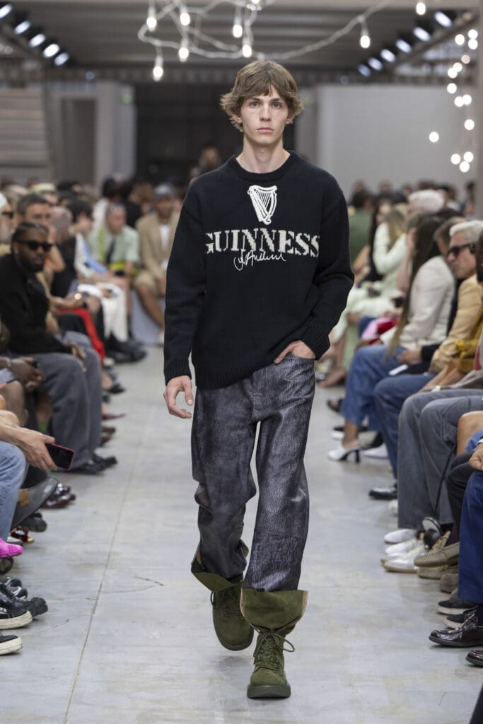
“For this season, I dug deep into things like therapy and sleep, analysing the creative practicalities that these elements harmonise,” detailed Anderson backstage post-show. “This season, I managed to partner up Guinness, a brand I’ve admired for many, many years: I’ve been asking them about their graphics and their visual technicalities, as I was a super fan of their advertisements back in the day; when they agreed to come on board, a connection sparked immediately and I began my research into iconography.”
He said, explaining that “[Iconography] is such a huge part of my childhood, and I like the humour and witticism that lies within it.” The richness of the Guinness foam recreated with billowing pearl embroidery took a classic luxury element and turned it on its head, making these words collide and proving a shrewd attention to shape. Standouts comprised pearl sweatshirts, which mixed elements of unexpected luxury and grounded them in familiar graphics.
On the clothing front, he speaks candidly about the landmark elements of his clothing.
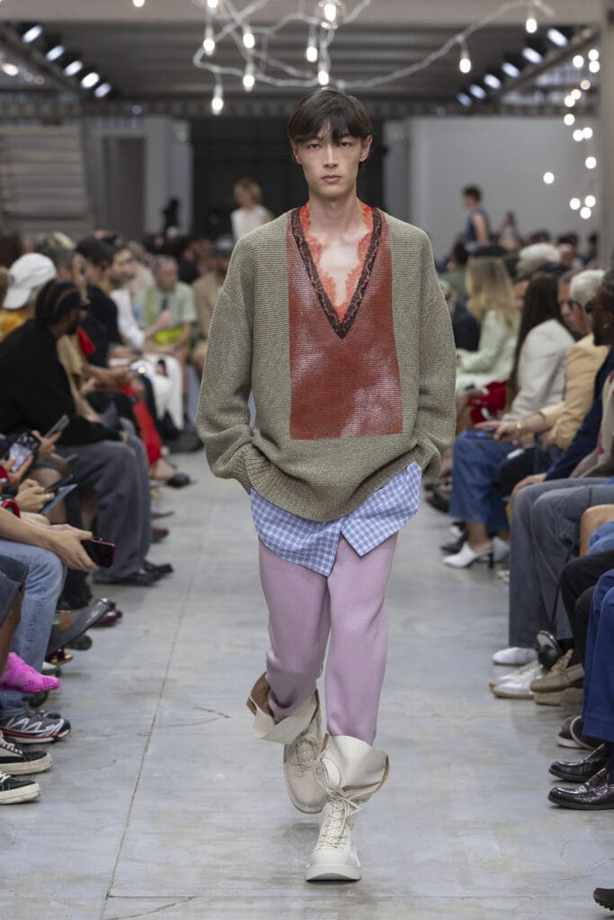
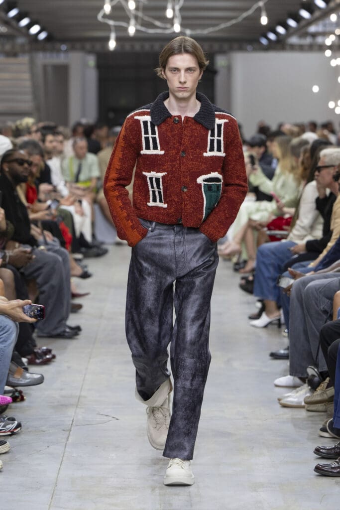
“The buildings that I drew epitomise different types of houses found both in Britain and in Ireland, where there’s Georgian terraced kinds and country cottages, too,” he said.
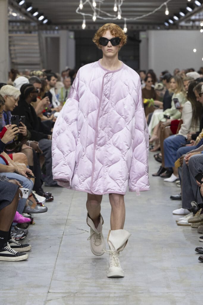
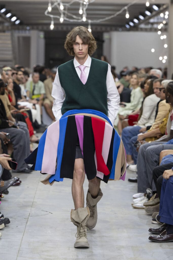
Translated into clothing, this birthed the idea of the up-and-down, nodding to the permissiveness of clothing and the concept of where we are today and how it grounds us. There’s also an idea of miniature scale and maximum proportions, which refers to the enormous ties or knits, or like three-dimensionality which, in this lineup, is knitted or woven.
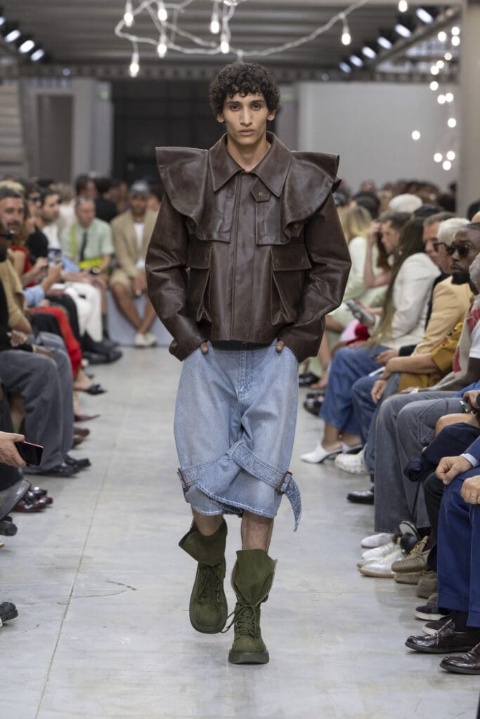
“There’s a sartorial depth of field somehow, where the proportion lies because what you’re looking at is small and then suddenly it soars,” he detailed. “With this collection, I wanted to play with that idea of naivety, as seen in details like the deflated balloon and a melancholic space cadet,” Anderson concludes.
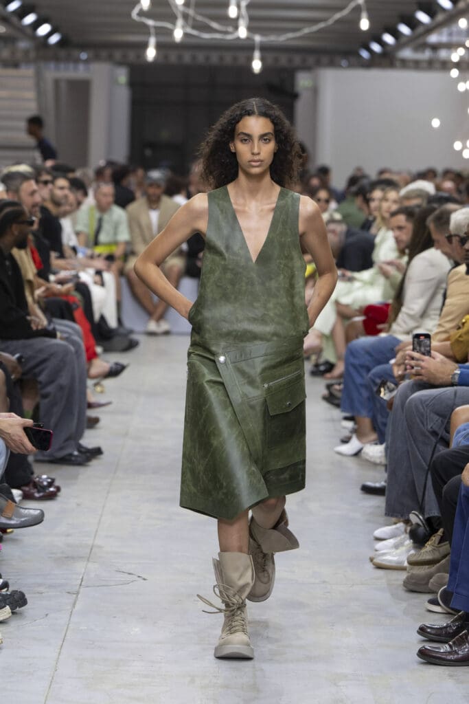
Such a concept conferred a buoyant, spongy and perhaps dreamy spin to the brand’s key staples, tied to the notion of repetition: amid the ease, there were sinuous, suspended looks like strips of cashmere that bounce up and fall into the realm of surrealism.
All in all, it served to further illuminate what a brilliant talent he is.
by Chidozie Obasi